Your Website Buttons Are Too Vague. Here’s What to Write Instead
Your buttons might be making people guess
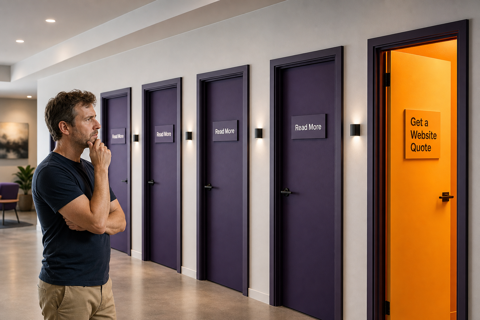
Most small business websites have at least one button that says “read more”, “learn more” or “click here”.
It feels normal because everyone does it.
The problem is that vague buttons make people guess what happens next. That tiny bit of friction can be enough for someone to stop moving through your site.
Clear buttons do a better job. They tell visitors where they are going, what they will get, and why it is worth clicking.
Why vague buttons cost clicks
A button should help someone make a decision.
“Read more” does not say what the page is about. It does not explain the benefit. It does not help someone know whether the next click is worth their time.
Compare these two buttons:
- Read more
- See our website redesign process
The second one is clearer. It gives the visitor a reason to click. It also tells them what kind of page they are about to visit.
That matters even more when someone is already busy, distracted, or comparing a few businesses at once. Which is most people, sadly.
Clear links help people move faster
Website visitors do not read every word. They scan.
That means your headings, links and buttons do a lot of heavy lifting. If those parts are vague, the whole page feels harder to use.
Good link text removes guesswork.
- Instead of “learn more”, use “View our website packages”.
- Instead of “click here”, use “Book a website consultation”.
- Instead of “read more”, use “See how our redesign process works”.
- Instead of “find out more”, use “Check what is included in local SEO”.
None of these are fancy. They are just clear. That is the point.
It can help your SEO, but it is not magic
Clear link text can also help search engines understand how pages on your website connect.
If every internal link says “read more”, you are wasting a chance to describe the page you are linking to. A link like Gold Coast website redesign services gives more context than “learn more”.
Google’s own documentation talks about snippets, links and “read more” deep links in search results. You can see the source here: Google’s snippet documentation.
That does not mean changing button text will suddenly push your site to page one. It will not. Anyone promising that probably also has a bridge to sell you.
But clear links are one of those small, sensible improvements that help users and search engines at the same time.
What to write instead
The easiest fix is to make every button answer one question:
What will the person get if they click this?
Once you answer that, your button usually gets better straight away.
- Get a website quote
- View website redesign services
- See our small business website packages
- Book a free website chat
- Compare website redesign options
- Check our local SEO services
These buttons work because they set expectations. People know where they are going before they click.
Examples for common small business pages
If you run a service business, your website probably has a few key pages: home, services, about, contact and maybe a few project pages.
Here are some stronger button ideas for those pages.
Homepage buttons
- Book a website consultation
- View our website services
- See recent website projects
Service page buttons
- Get a quote for this service
- Ask about this package
- Check availability for your project
Blog post buttons
- See our local SEO services
- Fix your website calls to action
- Talk to us about a website refresh
The words should match the page and the next step. A good button does not need to be clever. It needs to be obvious.
A quick check for your own website
Open your website and scan the buttons without reading the body text.
If the buttons still make sense on their own, you are probably in decent shape.
If they all say “read more”, “learn more” or “find out more”, there is room to improve.
This is a small website fix, but it can make the whole site feel easier to use. It can also help important pages, such as your small business website pages, get clearer internal links from the rest of your site.
Where this fits in a bigger website clean-up
Better buttons are not a full website strategy by themselves.
They are one part of a cleaner user journey. Your pages still need clear headings, useful content, fast loading, trust signals and strong calls to action.
If your site is getting traffic but not enough enquiries, button text is worth checking. So are your page structure, service copy, internal links and local SEO foundations.
Small changes can help. Bigger problems usually need a proper website review.
Need clearer website copy and stronger calls to action?
Spray Media builds websites that help small businesses explain what they do, guide visitors clearly, and turn more of the right people into enquiries.
If your website feels vague, outdated or hard to navigate, we can help tighten it up.

Written by
Mark SprayMark is the founder of Spray Media, a Gold Coast web design and digital marketing agency. With over 100 projects delivered and consistent 5-star reviews, he helps small businesses and tradies get more customers through websites that actually rank on Google. Before Spray Media, Mark built a national weighted blanket company recognised in Australian Parliament for its community employment initiatives.